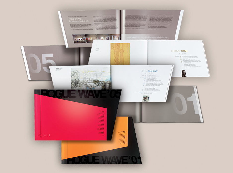
The catalogue is a marvel of print production: You got your fluorescent inks on the cover. You got your titles printed in spot varnish. You got your rakish 12° angle cut on the face. The whole thing is printed using stochastic screening for image clarity that’ll make you weep with geek delight. (Using a loupe, you can see the highlights on individual brush strokes with sharp definition. It’s something else, this stuff.) Did I mention that the book works from both sides to give both shows equal billing?
Yes, if you ever felt like making life difficult for your printer, this is a good start. I’m glad I had the dedicated printers at Typecraft in Pasadena on my side for this one. Moreover, I’m grateful that my clients at L.A. Louver extended me the trust and patience to produce a design that gives an uncompromising home to the brilliant pieces they selected for the exhibit. It was a tricky job and taxed everybody’s good humor, but we came out with a cool piece. I hope the chosen artists will feel well represented.